Is Tom Skerritt the new Clippy 2.0?

Regular readers will know that I like to chew apart Social website UI's and any other website UI that I think is doing things better or differently.

I am looking at this site See Windows Vista and I am amazed by the use of technology, the UI design and the usability. It's remarkable. I doubt Vista will be THAT good… will it? But the site itself is remarkable I think. Stuff slides around, it's so… so… usable.

clippy20.jpg

Having said that, I don't think this new Clippy 2.0 (Tom Skerritt) can avoid the same fate of the old clippy. hehehe. I mean, that's what he is right? He guides you around, he hassles you, he tries to be chirpy and interactive. If you do nothing for a while he even walks up to your "screen" and knocks on it to get your attention. (I took the screenshot as he knocks on my screen.)

So what do I think of this UI? I think this UI is not at all suited to the emerging social interface (I mean, how do you shoe-horn "social" into this UI?) So while it's fantastically attractive, it's basically a much more attractive web-based brochure. A better mousetrap… hmmm… that's not necessarily a bad thing!

PersonalBee & Squidoo (fight! fight! fight!)

I first wrote about thepersonalbee (blog) in this post: Tracking memes… and our world views

I went back for a visit today. Hmmm… it's relaxing.

thepersonalbee.jpgbeepanel.gif

I really like the simple interface. Not to ajaxified, not to techy. The left hand column "popular public bees" is so simple and inviting. (I didn't immediately see that this was a scrollable region though).

popular_pulic_bees.gif

Look at the simplicity of their message:

why_bee.gif

DISCOVER the news you care about.

SHARE the news with friends, family or colleagues.

BUILD your own news website or add news to your own blog or site.

So simple. I looked at some of the Bees and chose to view the Iraq one. Check out the 4 views. The search panel is well placed to the right hand side.

I ventured over to Squidoo to find their lens for "Iraq war" and searched for it. Their search engine suggested the tag "iraqwar" so I took that, and it told me "Congratulations you're the first to search for this term" and then offered to build a lens for it. Wow. No lens for the tag iraqwar that YOU suggested? Anyway, I persisted and searched for the "best lense" about Iraq.

Do yourself a favor and compare these two pages that are covering the same topic: Squidoo Iraq and Personal Bee Iraq

Alexaholic doesn't agree with me though. I wondered why Personalbee isn't doing better. I went to their blog. I found the following:

  • The UI that I like is brand new. I am convinced it will work well for them!
  • It seems that the Bee creation process was far complicated – they eventually needed a help file online and are now making a Bee creation wizard

How does Personalbee make money (from Siliconbeat)?

How does it make money? The Personal Bee writes a cookie to your browser, which sees the news that you are reading. The cookie is operated by a third-party company, called Revenue Science, which collects information about you from other sites you travel too. All this information helps Revenue Science serve up ads to other publishers — ads that are specific to what the system perceives your interests are. (ABC News, ESPN, Financial Times, Newsweek all serve the same Revenue Science cookie, so Personal Bee is not exceptional here).

Revenue Science serves up ads on other Web sites that you surf, but not on Personal Bee, which has decided not to run ads.

Interesting!

Another good review on it.

Let me give you my three favorite reasons to like Personal Bee:

  1. I choose who’s important. I can calibrate Personal Bee to let me choose what RSS feeds are important to me on any particular topic.
  2. Time relevance. Personal Bee  places a three-day time frame around an event.
  3. Phrase Clouds replace Tag Clouds.

What I like about Netvibes.com UI

I'm still thinking about the perfect Social Website 2.0 UI.

Here's some of the things I really like about Netvibes (blog). Netvibes seems to have begun life as a site that collects news feeds and APIs from literally everywhere.

It's RSS features look basic but good:

discovery-example.png

In order of priority here are some comments:

  1. It hides it's complexity – most options only display when you mouse over the item. Until you show an interest in something, it hides itself. It's an "intentional" design. Excellent.
  2. Edit the page right there. Want to change the name of the page? Edit it right there, no going into an admin system somewhere else. Woohoo! I hope I can save the layout permanently? Can I share my layout with other people?

Some more things I like:

  1. Useful ajax features (not just ajax for the sake of ajax)
  2. I can reorder things as I want them.
    todo-reorder.gif
  3. Ease of use – for example the ability to make new tabs simply by clicking "new tab" and then include a personalized icon (sweeeet!)
    en-tabs-new.gif
  4. Multiple language support

The only thing I don't get about Netvibes is that I don't have a use for it. It's like this amazing UI with awesome flexibility and ease of use.. but other than integrating with GMail, what would I use it for?

Some old products from Microsoft (like Commerce Server) felt and behaved like an SDK (software development kit) and nothing more. In the same way, this website feels like a demo UI of a forthcoming product… I feel like I'm waiting for the product (they sure have the UI right!)

Ok, in one of their blog posts (Netvibes launch a 1 GB personal web storage module!) they refer to "another move toward the web desktop" and that more clearly outlines what they are offering – and why I'm not responding to their offering – I don't need a web desktop. They are being all things to all people I guess. Very ambitious and very courageous.

How do they make money? 

I may not need a web desktop, but I'm loving the idea of all my email and word documents being online. With Google buying Writely (blog) and other offerings like ajaxWrite, ajaxSketch, ajaxXLS and so on we are certainly on the cusp of an online office.

Check out an old post of mine: Office 2.0 (as in Web 2.0).

Feeds 2.0

In a recent post (Different kinds of social/meme/news sites) I described the different kinds of news sites. One of those types is an online feed reader.

Enter stage from left: Feeds 2.0 (blog). This is their look and feel. Nice. Simple. Clear. It screams out "read your feeds on this page!" They innovate by personalizing your feed for you.

feeds21.png

Crazy Egg: I’ve been waiting a long time for this tool

Crazy Egg: with crazy egg you can easily see where visitors are clicking on a page and where they are not.

Here is their overlay example, it shows percentages as a floodbar.

crazyegg_screenshot_overlay.jpg

Here is the heatmap example, Shows the hot areas of user activity.

crazyegg_screenshot_heatmap.jpg

Here is the heatmap activity for WordPress – interesting eh? Thanks Matt!

wpcom-heatmap.jpg
Crazy Egg is a genuinely useful tool for evaluating what users are attracted to. Just glancing over the WP heatmap I can see what people are responding to. There are so many social websites with cool use interfaces – Crazy Egg will remove the guesswork from it all and tell us what really works.

Update:  I'm using the demo. It's just one (1!) line of JS put into the end of the page. Awesome! Now if I could track the usage patterns in some kind of data format – then I could generate reports of how the usage patterns change as we redesign reBlogger.

Next generation of Talk Digger

Another heads up: Some screenshots of the next generation of Talk Digger. Read the full post or just check out the screenshots below of the upcoming improvements to Talk Digger (blog)

TalkDigger2.png  TalkDigger1.png

Great looking UI trick

Take a look at the borders around the twistedpolygon page. Hold your mouse over it. Move your mouse. Click your mouse. Cool huh? Go Macromedia!

Creating the perfect Ajax UI

I am looking at this meme page about river of news.

Here are the things I like about this UI:

  1. The name of the page is SEO-friendly, which is why I could find it in Google
  2. It hides extra stuff until you need it – for example the voting icons only slide in if you hover over the post itself
  3. The voting explanation text is hidden – unless you hover over the voting area, that's the only time you need to see the details
  4. The overall usefulness of the post is indicated by an icon

Things I don't like about it:

  1. Posts that have been voted not useful are not hidden from sight but still available (condensed like this)
  2. Hovering your mouse doesn't pop-up (using Ajax) the entire post to read it quickly, you have to go to a new page to read it
  3. You can vote without actually reading the whole post!
  4. Hitting "next page" loads a new page (not 2.0 Ajax-ified)

What are you likes and dislikes in an Ajax User Interface?

Analysis of comments threshold and post voting

I have written quite a bit on meme sites and UGC (User Generated Content). You may also have noticed I am fascinated by the Slashdot vs DIGG comparison.

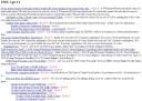
Below is a typical layout of reBlogger posts for a given day. It's not inspiring. But that's ok, we were targetting SEO companies who are not focussed on the user experience (ajax, voting etc.)

RB page

But as we prepare the user-theme-website reBlogger (a tool to build meme/DIGG websites) which is under-construction here and here I am exploring more and more in this blog the ideas surrounding relevancy, user-generated content, user-interaction, community involvement, exploration, semantic web, tags, research and user-context and blog-post-context (and trying to match them).

In this post I am exploring thresholds and voting. First let's look at some leading examples of each.

Haven't we figured out that the crowd is generally smarter than any one individual in the crowd? – Jeremy Zawdony

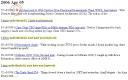
Here is a screenshot of Slashdot style "below threshold" ranking of items. The users get to vote on what is useful and what is not… but it's for comments on posts. For anyone who has tried to read the MASSES and MASSES of comments on a slashdot post, this threshold stuff is invaluable.

Slashdot page

DIGG implemented a "below threshold" concept in their system too… but it's also for comments only.

DIGG Comments

So thresholds work well for a big flow of comments. Yay. But when you have an enormous flow of posts, could we also use this threshold concept?

Of course in terms of matching my user-context and the context of the voter, if a visitor votes down any post covering a team they don't like – that should not affect my view if I like that team! Sigh. So I really should only see the effect of votes from people who have similar keywords to mine. They like the same things as me, and therefore their votes are far more likely to be relevant.

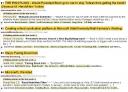
Below is my very unattractive rendition of what user-voting combined with thresholds could do for blog posts. If you add in changing background colors to highlight the items that match their selected keywords – then a visitor can FAR more easily scan a page to view items that match their keywords and are voted hot by visitors who perhaps have more time on their hands to read and vote on everything! 🙂

RB and slash page

In my imagination I could visit the World Cup 2006 site and quickly scan for hot stories that match my interests (south african or australian teams).

It would be great if unread items were bolded and read items weren't. Heh. CSS already does that. Woohoo.

OK, I user-tested this with Joel. He didn't get it. Let me try again. 🙂

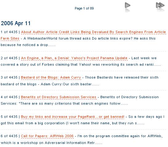
Below is a typical reBlogger page on TopXML – in amongst all those posts, some are clearly better than others. How do I (a reader who is interested in the topic) determine which item to read and which to skip?
rb_topxml.JPG

Enter stage from left: thresholding.

In this page we have hidden the items which other users have voted down, or (inversely) which have not been voted up. Now only the really good stuff is displaying and I can get to the other items if I want to.
rb_threshold2.JPG

I added three extra goodies in the picture above:

  1. faded background highlighting to draw the eye to the hidden info
  2. if some of the voted-down posts contain my keywords I have specified that I am interested in, I am notified
  3. I inserted a star in the top most post, to somehow indicate that this post is truly a winner. We have all seen these kinds of posts, they are just head and shoulders above the rest. They should get a star, so when I view the page I can immediately click on that post with the certainty that I will see a cracking-hot post.

One concern is: because this is ordered by date (not by vote) the newest posts will always have a vote of 0, and I guess 0 should be above the threshold? But that kinda defeats the idea of hiding the complexity. Sigh. Hmmm… some users will want a threshold that includes 0 (view all new items) and some will want 1, 2 or 3 or whatever. Some may even want to view all – including viewing negatively rated items.

Some sites also use grouping of similar topics… but we aren't doing that yet. Here are some examples of that.

Cloudee (below) groups similar posts, but doesn't have voting + thresholds

Cloudee

The ever-wonderful Chuquet (below) also groups items and handles information overload by hiding it all and saying "(45 linking articles in the last week…)" and giving a link to all of the items. Quite effective! They don't provide voting.

Chuquet

I see that everyone thinks that thresholds is for commenting and voting is the way to solve information overload for posts – but I think that voting can result in thresholds for posts – it's the ideal way to sort the wheat from the chaff in blog posts.

built_with_reblogger2006.gif

SEOData gets a facelift

SEOData has had a facelift! Let us know your feedback.

What is SEOData? It's the flagship website for reBlogger wrt SEO customers. We explain how to use reBlogger when you have SEO needs.

reBlogger.com is our flagship website (currently under construction) for theme (or digg) oriented customers. We demonstrate how to use reBlogger as a development platform to build you own diggstyle website with voting and more. Read Coding reBlogger to follow it's development. The current project is to show how reBlogger can be used to build a Football World Cup 2006 DIGG site – in only 10 days! What would YOU do with your reBlogger?

reBlogger – it's many things to many people! 😀

built_with_reblogger2006.gif

RawSugar, whonu, TalkDigger

RawSugar. I can't figure out why, but this service is not engaging. It may be brilliant, and it certainly is someone's love child that they have worked hard over… but when I view this page I find myself waiting for it to do something. It's waiting for me. Nothing happens. Why? what is missing?

Who Nu? (whonu) (blog). Clever 2.0 name! But the interface is so full of choices that I spent ages trying to figure out where to start. Then the "lightning searches" horizontal band started flashing and I couldn't make it stop. Shows great potential – if only I could make it work. Great looking site though.

These two sites might be struggling with the UI challenge I am referring to in this post: Battle of the UI’s (search *or* meme/social)

Battle of the UI’s (search *or* meme/social)

It seems to me that every service has one or two things that they do. No one does everything. reBlogger does a lot of basic "engine" things well (take a look at my tongue-in-cheek post about how to make a free reBlogger to see the fairly long list of things we do well). It's almost like we have innovated in the technology stack (the "engine") but now we have to innovate in the user-facing features area.

For our upcoming public version we need to build a whole bunch of user-facing software. In the same way that we tied up the various engine aspects we must tie up the various user aspects too.

So if we're going to build a user interface – what should it be? We have two choices. Search or social. But not both.

If we go with a search interface, then make searching very simple (Google-style) but then innovate with the results (like Flikr has done). But if we go with a meme (or social) interface then the layout itself has to be interactive (voting, ajax suggestions etc.) as well as innovating with the results.

Think about it. Why doesn't Google offer voting? They have chosen the search interface. Technorati, cloudee and the excellent chuquet have all chosen the meme (or social) interface.

Update: It's possible that the "builder" interface might be social and the "user" interface is still search oriented. The two types of users have different needs. The one wants to see the "raw material" (posts and feeds) and the other is passively searching.

In my previous post I commented on the enormous number of websites in this space. Well… while writing this post I've found yet another one! CrispyNews (blog, must see example). Interesting – they also do ad $ sharing. In terms of voting I love it that rojo calls it's vote "adding mojo". Heh. Cool. dotnetKicks calls it "kicking". DotnetKicks also does ad $ sharing.

built_with_reblogger2006.gif